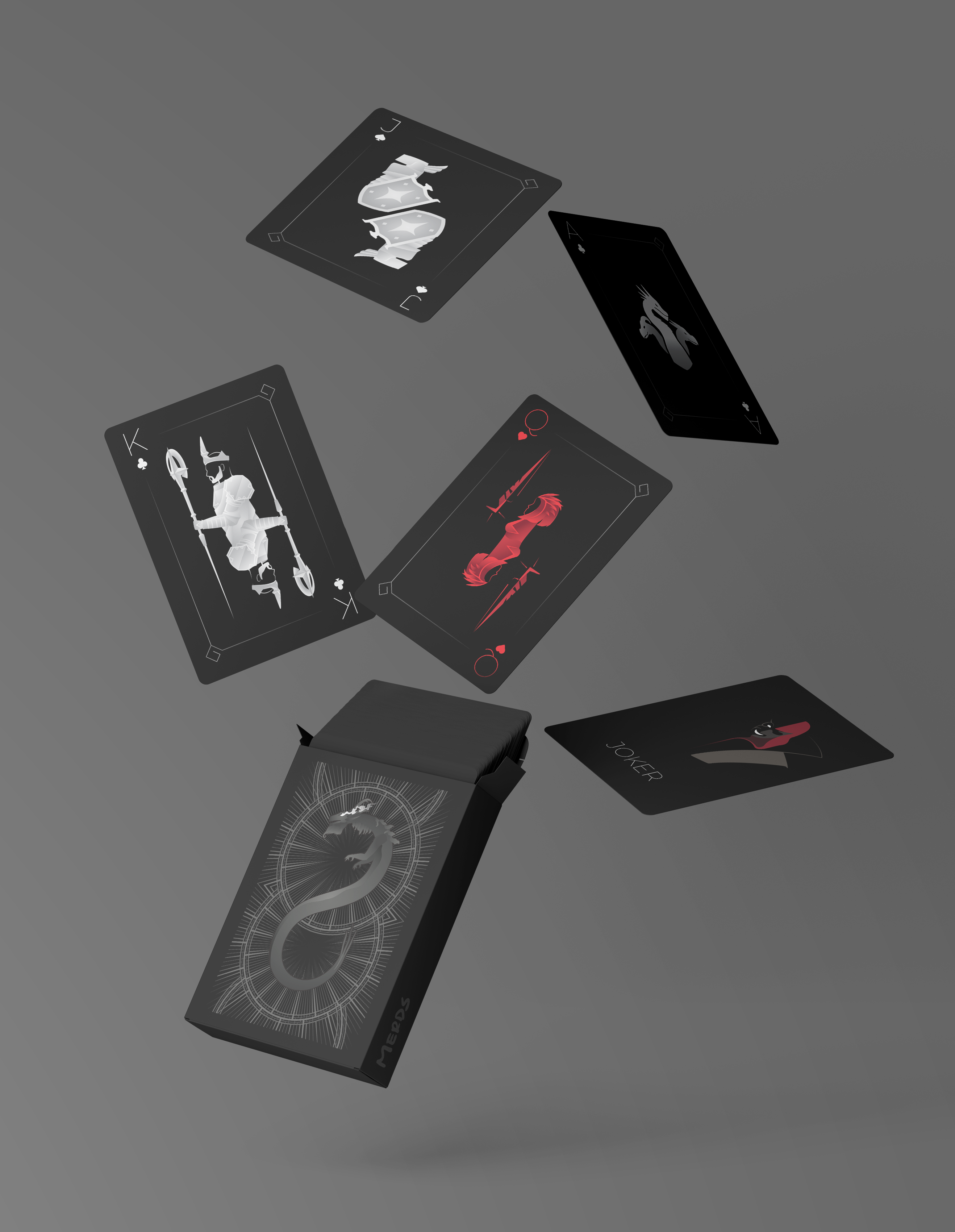
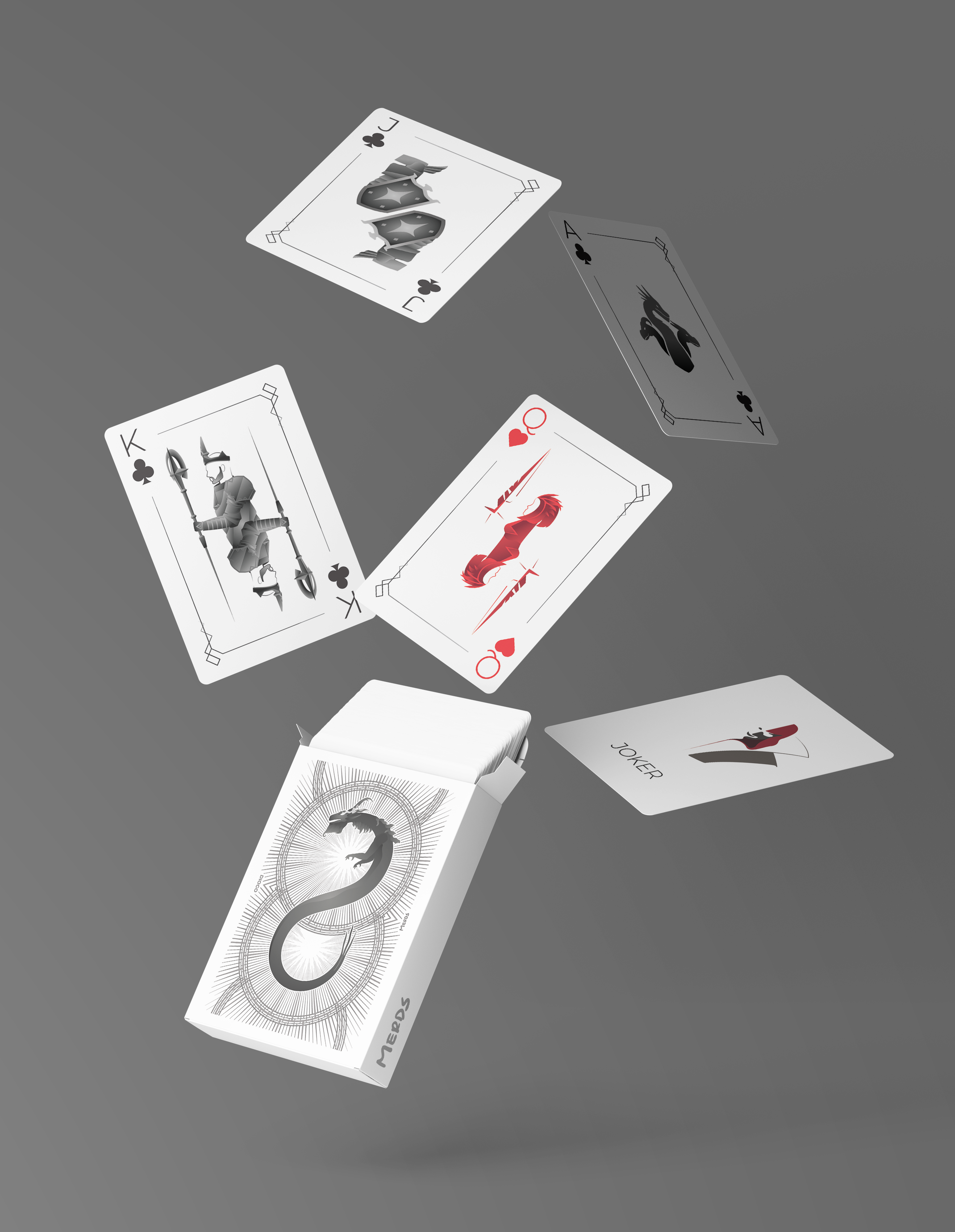
RuneScape Card Deck

- Category: Web Design, Illustration
- Team Size: 1
- Year: 2020
The goal with this project was to combine my love for interesting playing card designs and a game that has been with me through most of my life, RuneScape.
I wanted to make a black, clean looking deck of cards based on RuneScape as a personal project seeing as it is something I could use on the many game nights I have with my friends.
I, then, made a website to display the entire deck as a way of sharing it, available on:
https://diogofreitascastro.github.io/RS3-Card-Deck/
Cards
After deciding I wanted the card deck to be RuneScape themed and have a sleek design, I had to find characters from the game that would play the King, Queen and Duke, as well as what I could use for the Aces.
Having decided these, I started looking into how well I could portray the card while having in mind the 180º rotation that the figures have.
Then I started by sketching out on Illustrator what the profiled shape could be, leaving room for the 180º rotation, upgrading the brushed sketch into pen-tool shapes that would then be filled with gradients.
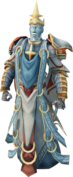

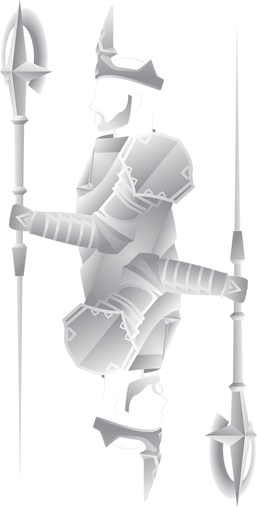
Saradomin, the character picked to depict the King, the sketch and the final design.
After having the main element of the cards drawn, I looked for other elements I could use for the borders of the card, and I found these geometric swirls on their website.
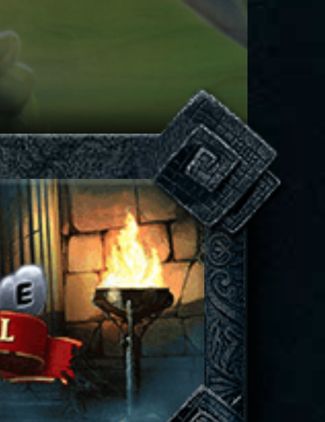
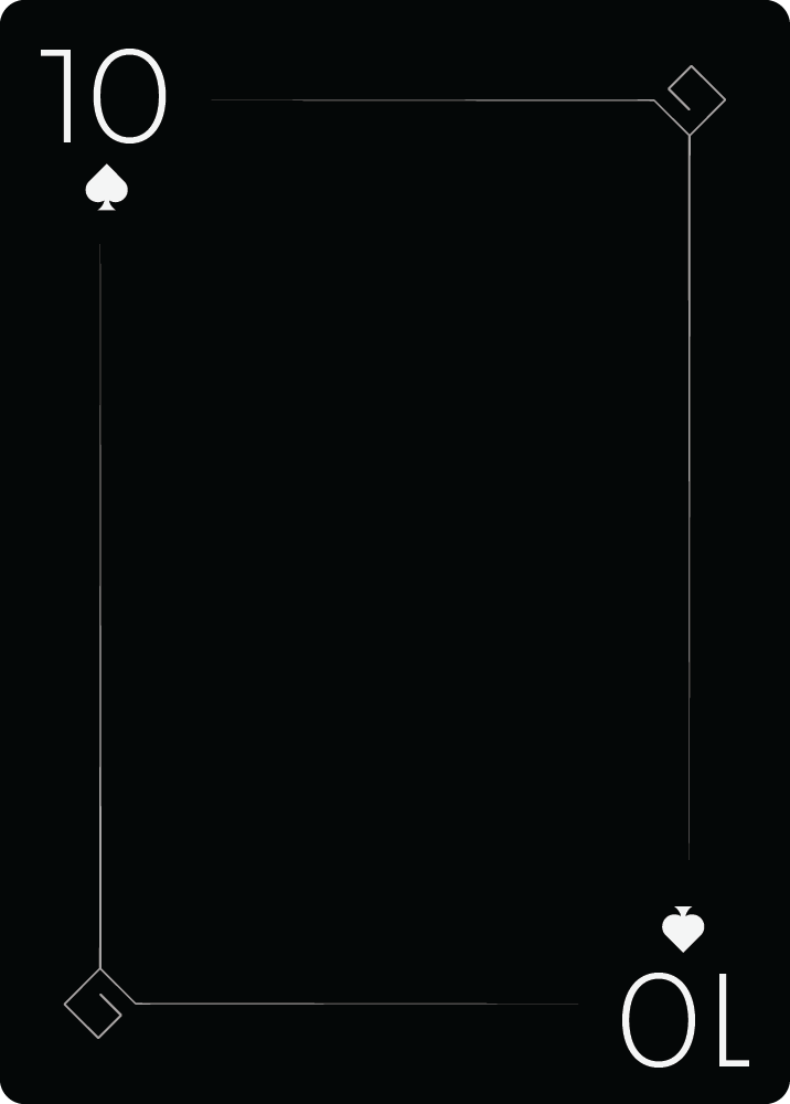
The geometric swirls on the website and the 10 of spades with the swirls on the corners.
For the back of the card, I wanted something elaborate and very detailed while still keeping some sort of symmetry, something that would look good even when flipped. I found this boss called "Seiryu" that's basically a big dragon-snake that I could shape into an S. Then for the background I decided to mess around with circles and spikes.
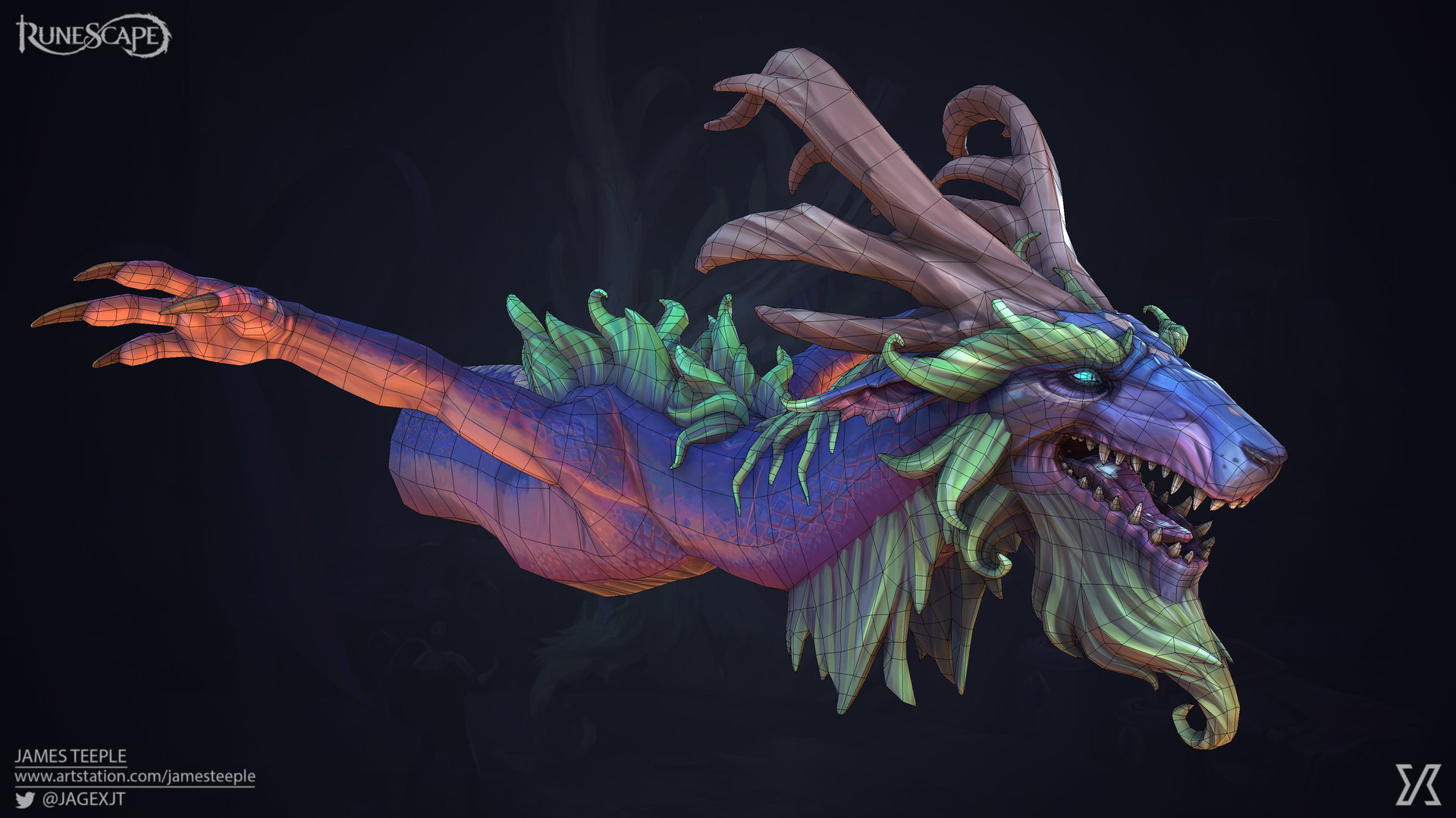
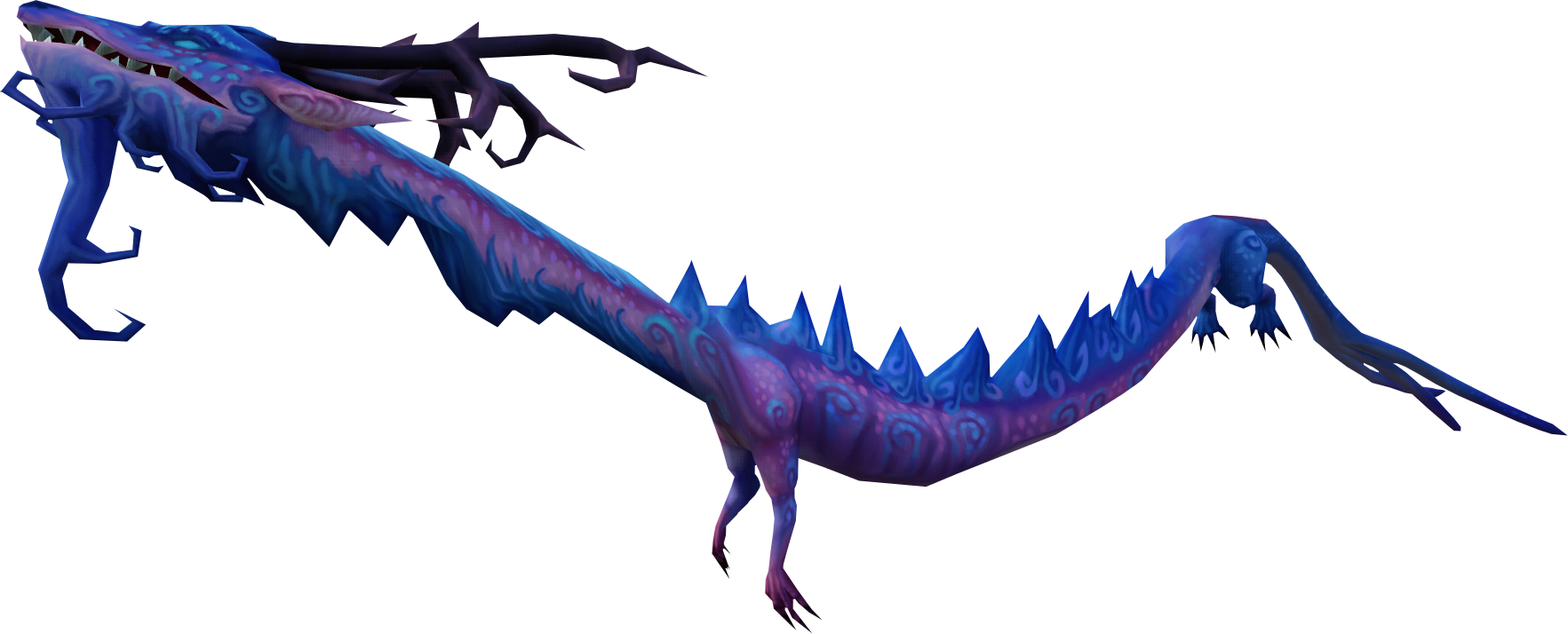
Seiryu seen during the boss fight in-game and another monster that's similar looking, to see what Seiryu's full body would potentially look like.
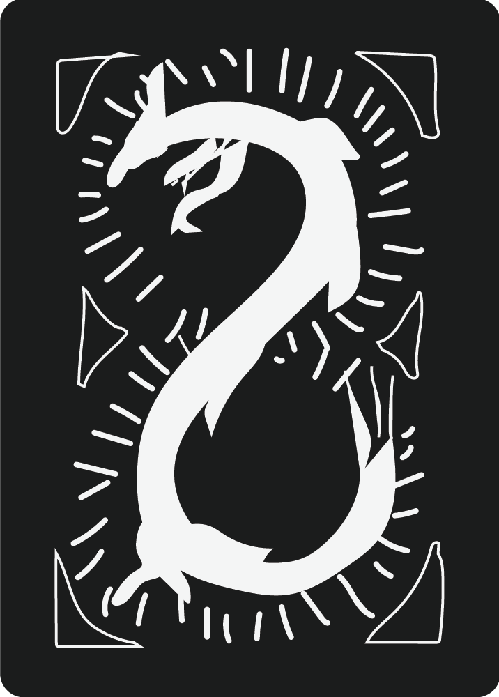
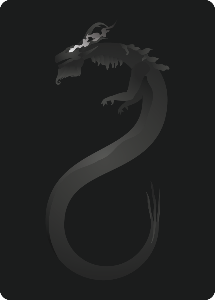
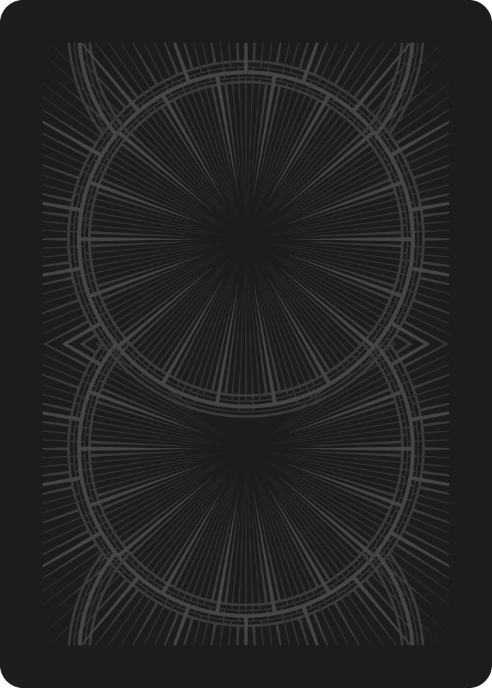
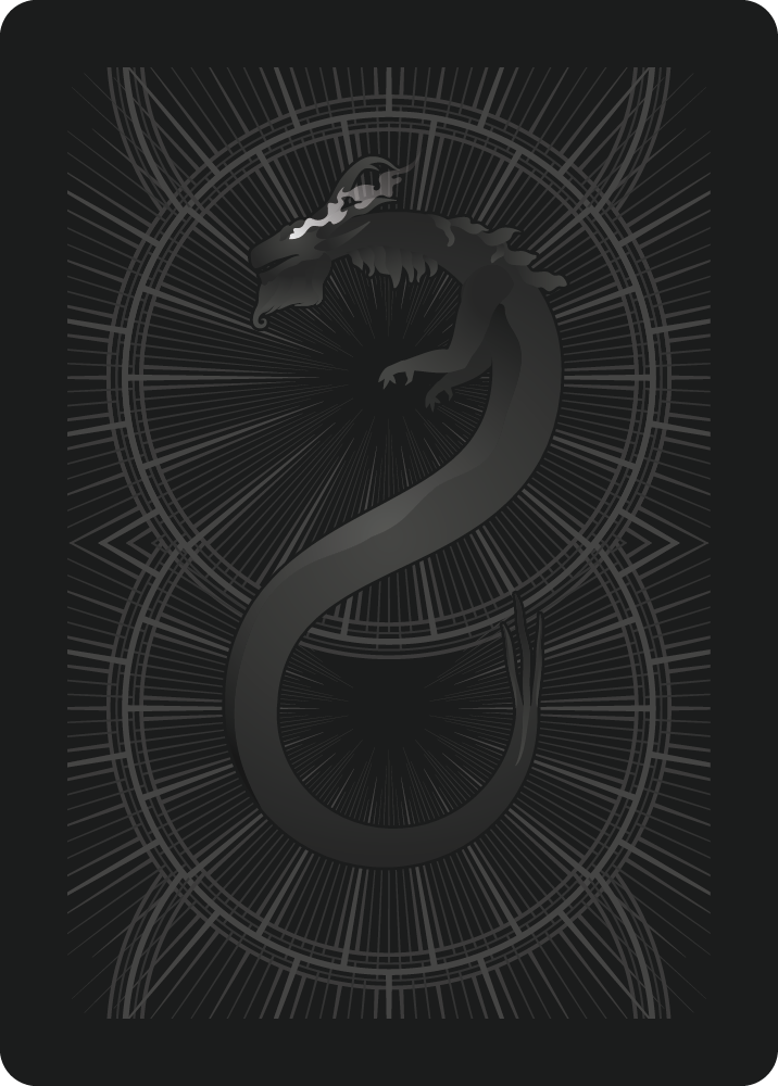
The sketch, Seiryu for the main element, the background and the final design for the card back.
Website
The website idea started as a way to present the cards to everyone. Since I enjoy webdesign I thought I'd try and make a little website for them, as I also wanted to try some new CSS/JS stuff. The full website can be seen and interacted with on:
https://diogofreitascastro.github.io/RS3-Card-Deck/
Preview of the website with the 3D Aces as buttons.
Gallery
